Fantastic Black Friday email design elements and how to create them with Canva
If there’s a time to slide dazzling imagery into your marketing emails, Black Friday and the surrounding days are it.
Competition is at an all-time high for the busiest shopping stretch of the year. Just consider your inbox and how quickly it fills up before, on and after Black Friday. What tends to captivate you?
We presume that the answer is visuals. One strong image — such as a commanding hero photo — can catapult a Black Friday email design. Other times, a slight visual touch can turn heads and encourage a closer look.
So we journeyed through the email marketing wild, hunting for spectacular Black Friday email design examples worth mimicking.
In this post, we’re demonstrating how to recreate eye-catching design elements with Canva, our favorite design tool for any level of creative aptitude.
The impact of design on BFCM emails
While the holiday shopping season timeframe may have ballooned over the last decade, Black Friday and Cyber Monday continue to dominate.
In 2022, Americans shattered the record for shopping over the “big five” period between Thanksgiving and Cyber Monday. The National Retail Foundation reports that Black Friday was the most popular in-store and online shopping day.
Why are we mentioning these stats? Understanding the massive opportunity to reach customers looking for deals and gift ideas is essential. Formulating a high-converting Black Friday email marketing strategy is vital to capitalizing on it.
And creating attractive Black Friday emails that connect with subscribers is part of the strategy.
Well-designed emails — those that have a logical flow, follow structural best practices, and aren’t crammed to the max with photos and dense text — can go a long way in separating you from the amateurs and establishing consumer confidence in your brand.
Drop in pieces of eye candy — whether simple graphic enhancements or a visual masterpiece — and raise brand perception to a new level.
Elevate brand trust, and you elevate conversions.
Ensure your Black Friday email design isn’t wasted effort by creating Black Friday email subject lines that get them opened.
How to replicate 7 Black Friday email designs with Canva
Now for the fun part!
Our collection of Black Friday emails made the cut for different reasons. Some are easy to pull off. Others are more ambitious yet doable, regardless of design and Canva knowledge. All design elements will lend your Black Friday email designs an extra edge.
We didn’t replicate any example verbatim. Instead, we’re showing you how to apply the concept to create a variation for your brand.
#1 Background image with striking text
Cosatto demonstrates that you don’t need a photo to make an impression.
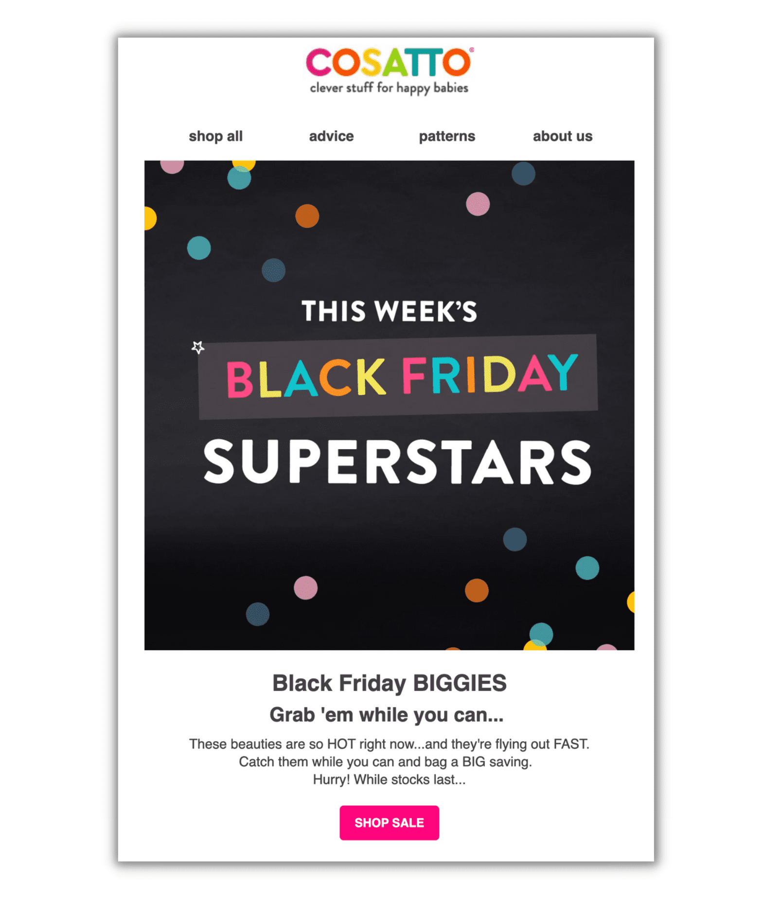
Text paired with a background can do just as well for a hero image and is a prevalent tactic for drawing attention to your Black Friday discount promotion. It’s like announcing your deals — a considerable percentage off, perhaps? — with a digital megaphone.
Here’s how to replicate it:
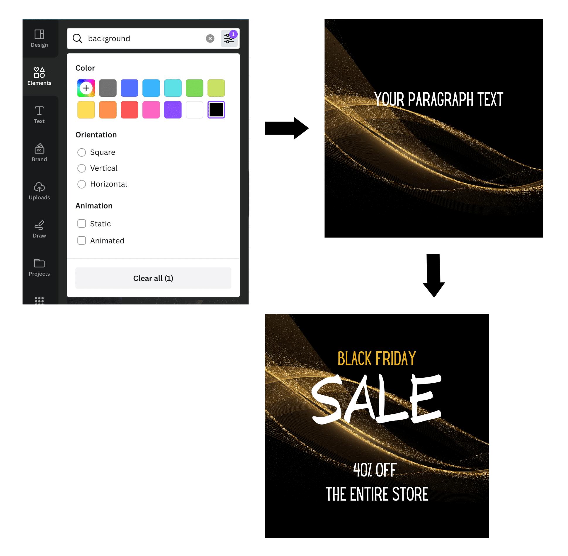
- Search for a background from the Backgrounds tab in Canva. Alternatively, pick a graphics-based image from the Elements tab. With the second option, you can filter preferences according to color, orientation and animation. (We found more options by typing “backgrounds” into Elements.)
- Add text in a contrasting color so it pops. Keep it short — four to eight words is a good rule of thumb — and go big. Experiment with flashier custom fonts that aren’t appropriate for the live text portion of your email. (Use web-safe fonts in your text to ensure proper display by the email service provider.)
Other options:
- Use a product photo as your background. This works well if you have a product or lifestyle photo that needs a little boost to make it worthy of the spotlight.
- Add a call to action (CTA) button within the image by drawing a box with corresponding text like “Shop Sale,” then add a link to the hero image once inserted into the email.
#2 Photo with elevated design
Let’s say you have a photo you want to highlight, and you want to make a bigger splash. Twistshake’s Black Friday email design is one way to do it.
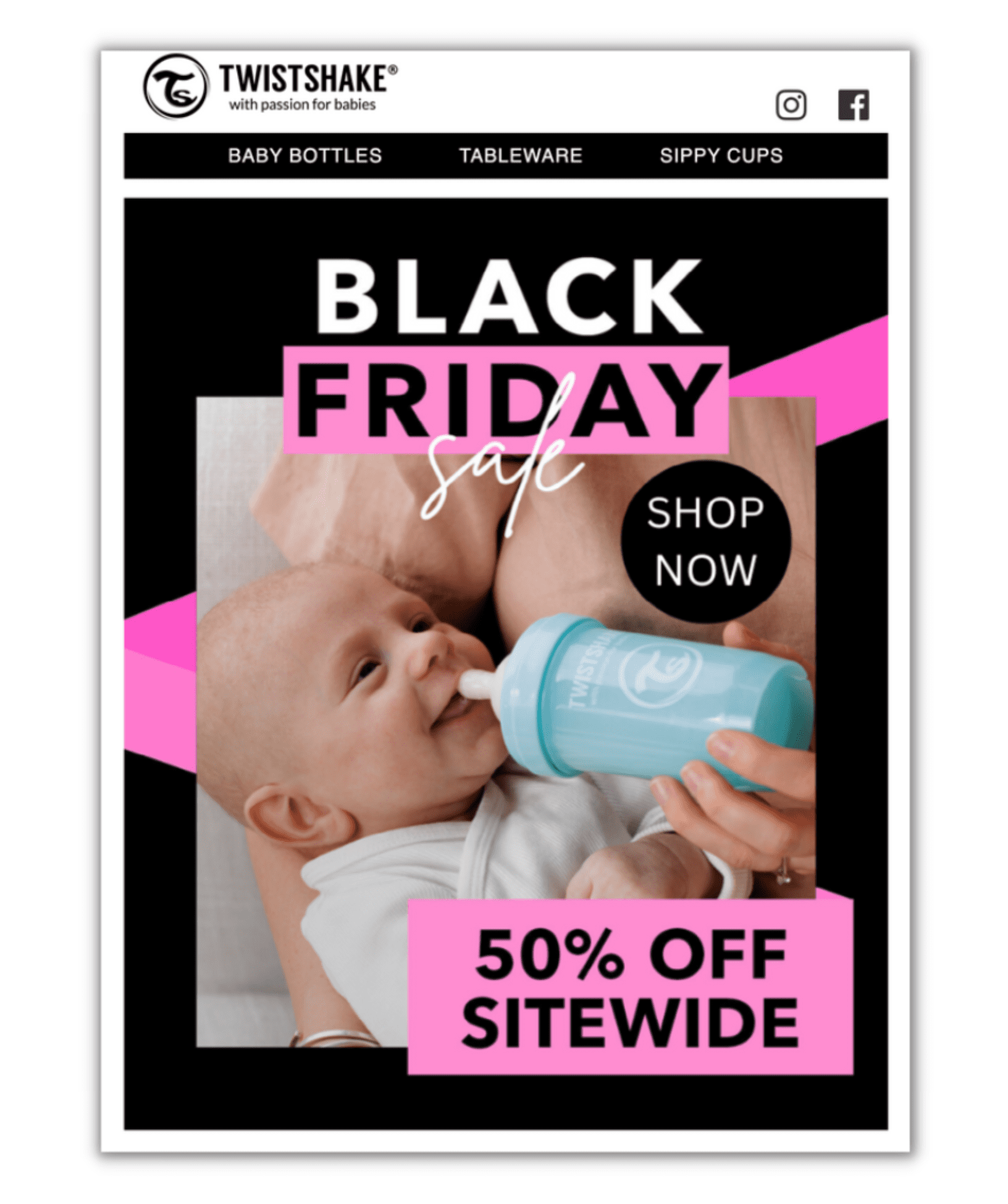
They take an inviting lifestyle image featuring one of their products and add fuel with graphic embellishments. The photo, mixed with bold text and dynamic splashes of color, certainly catches our eye.
One note about product photography: high-quality photos communicate in a way that words can’t. Studies show the brain processes visual images 60,000 times faster than written messages.
Here’s how to replicate it:
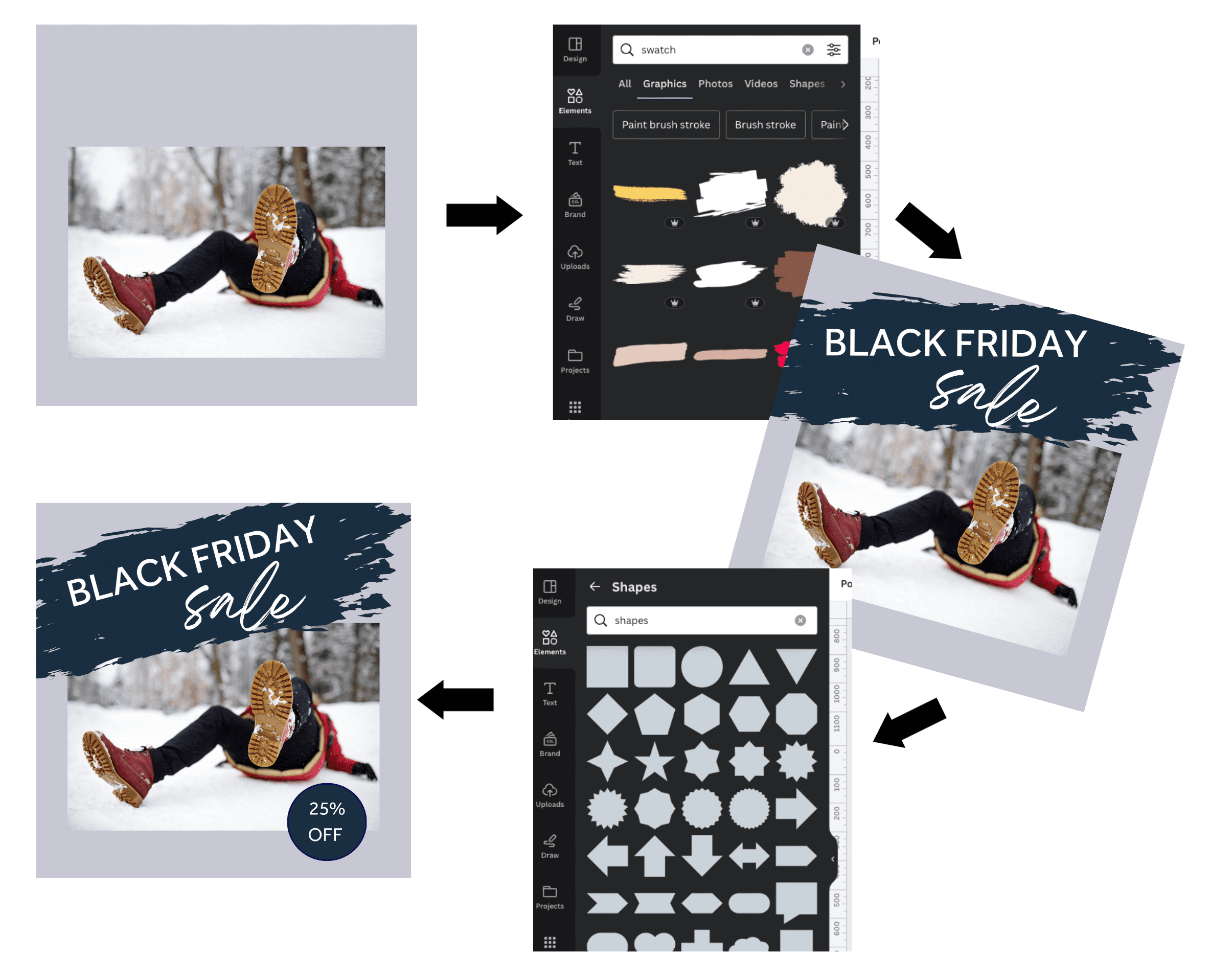
- Pick a solid background color; you don’t want a busy backdrop to compete with the forthcoming graphic elements. Add your photo.
- Search Canva Elements to dress it up. Keep it simple, as you don’t need a lot to go from “blah” to interesting. To duplicate our look, search for “splotch” or “swatch.” Then, layer on the text.
- Finish by adding details. For the 25% off callout, we typed in ‘Shapes” to bring up the circle element.
#3 ‘Holidayized’ logo
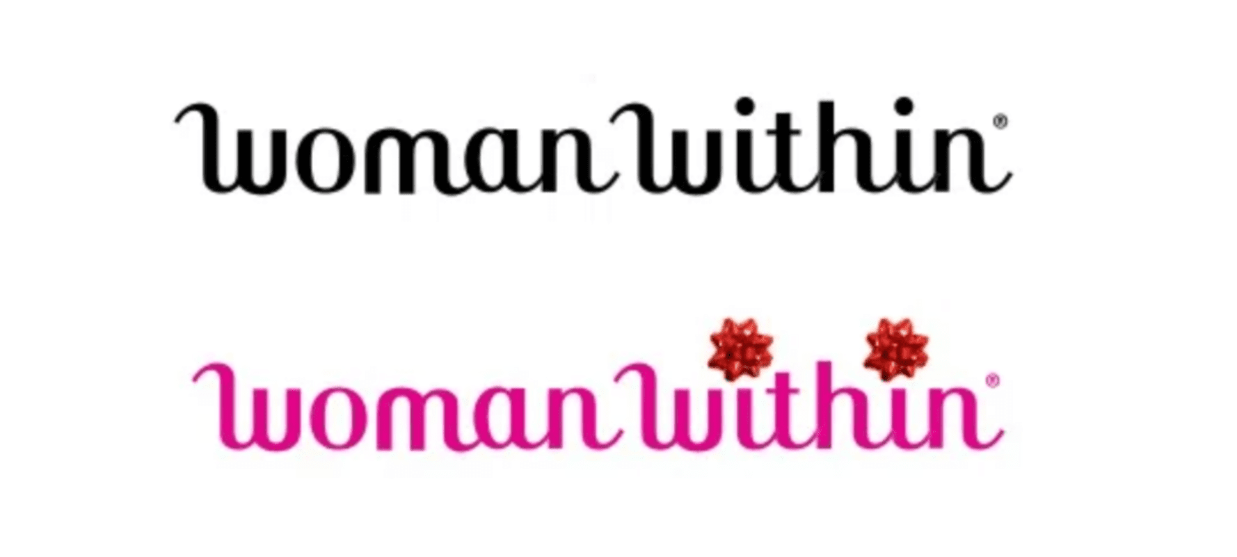
‘Holidayize’ isn’t a real word, but we’ve coined it to describe anything that visually lends a touch of holiday cheer. Temporarily tweaking your logo is the perfect opportunity to infuse some fun. You can use it repeatedly in your Black Friday email campaigns and subsequent holiday email newsletters. Plus, it’s super simple to do.
See the small garnish that Woman Within adds to its logo?
Here’s how to replicate it:
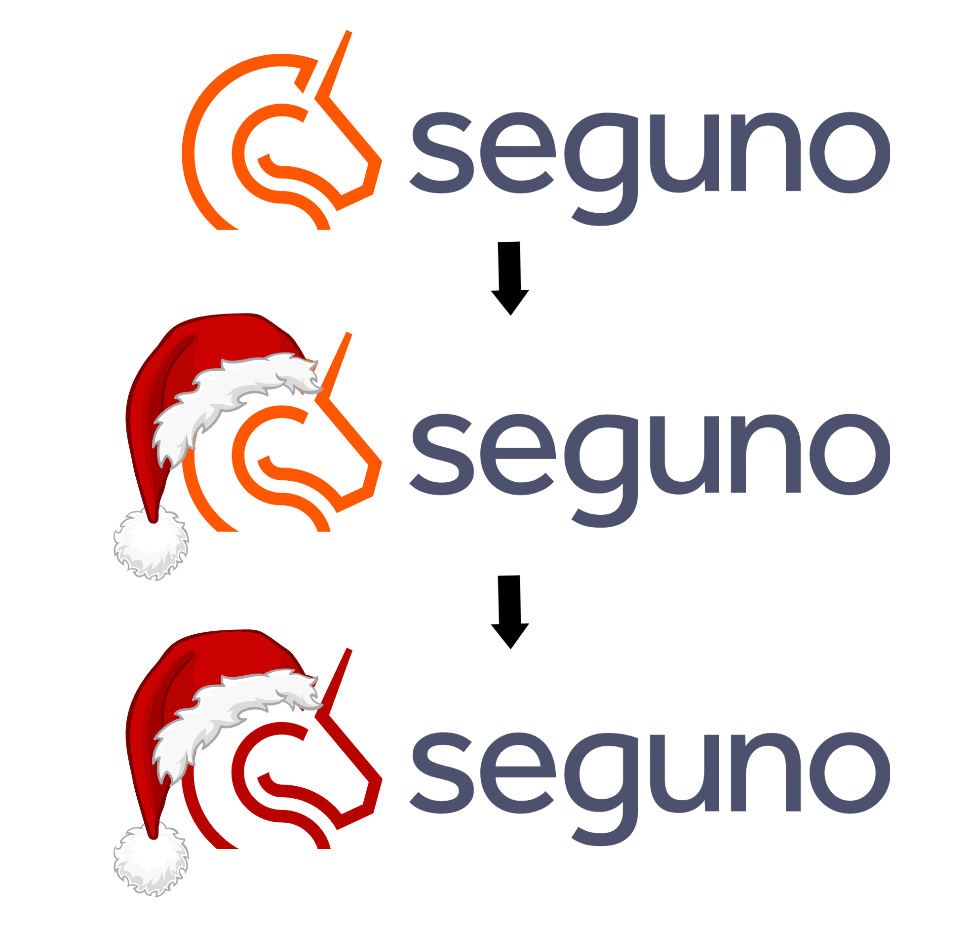
- Upload your logo into a Canva document. We’ll use Seguno as a hypothetical example.
- Pick your decoration. A bow? Reindeer antlers? Stack of presents? We decided our unicorn needs a Santa hat.
- Adjust logo colors if they clash with your embellishment and you’re comfortable straying from branding rules.
#4 Holiday graphics
If dressing up your logo isn’t suitable for your brand, experiment with ornamentation in hero images. Check out Brooks’ take.
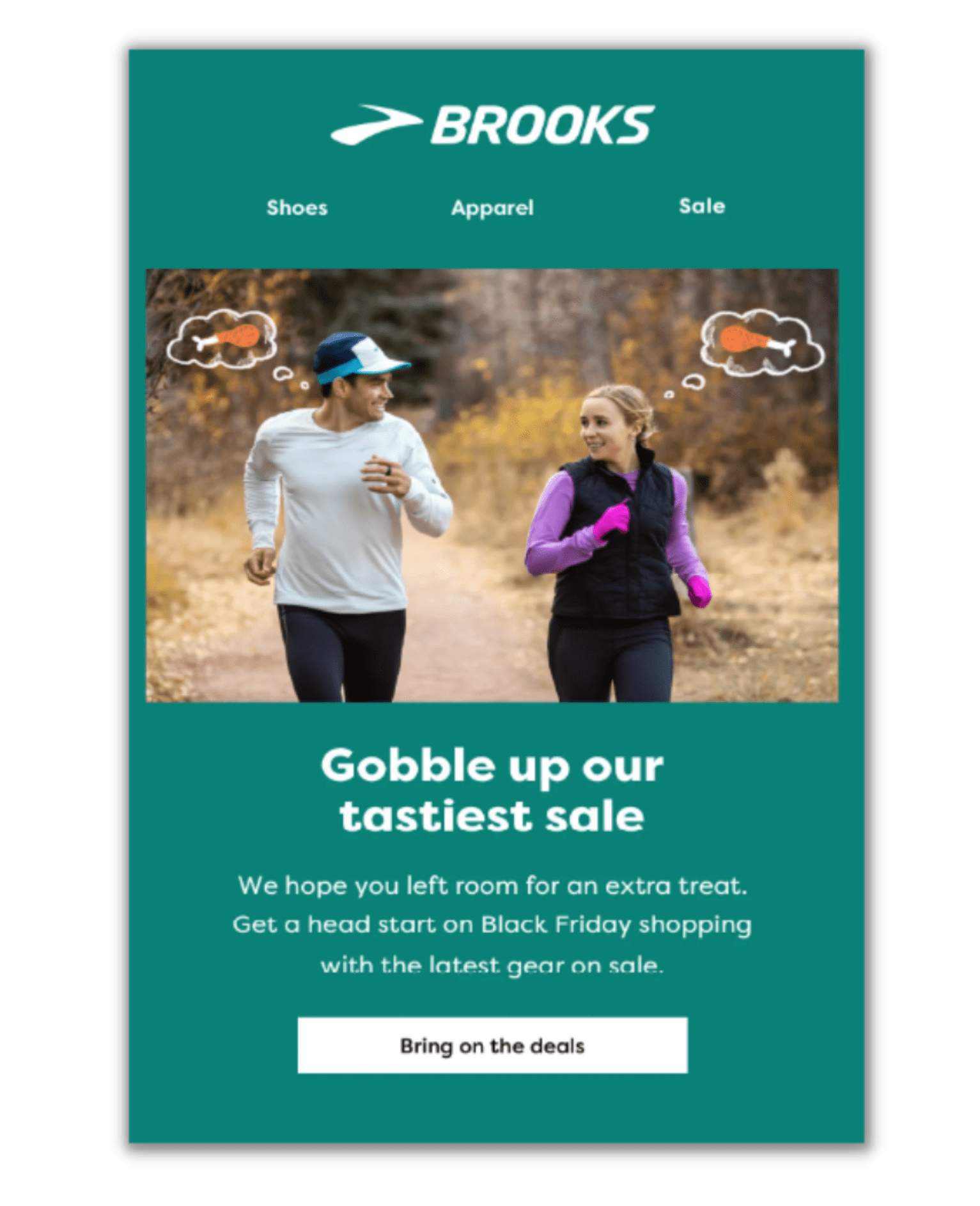
Graphics can be as straightforward or as advanced as you’d like. Either way, it’s a fun exercise in injecting texture. Brooks also connects the dots between their product and what subscribers are celebrating, equating to relevant messaging.
Here’s how to replicate it:
- Drag a product photo into your Canva design.
- Search for a suitable graphic Element that enhances your image.
- Don’t worry about text. Every email doesn’t have to scream “Black Friday sale!” at the outset. You can reserve that for the headline email section.
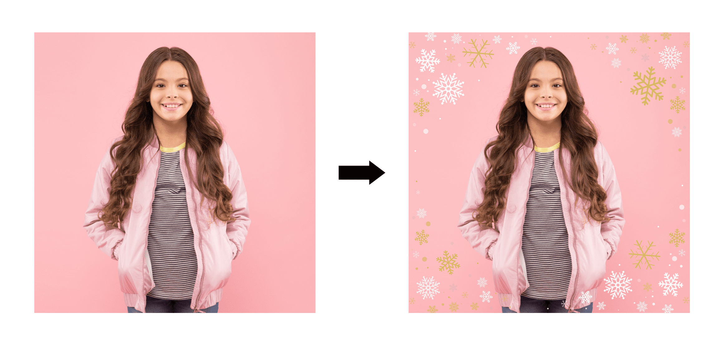
Sprinkling in holiday graphics can work splendidly in grabbing attention. But if you want a playful, clever approach like Brooks’ Black Friday email design, give yourself time to piece together the concepts — from the photo and image additions to the headline.
#5 Reshaping photos
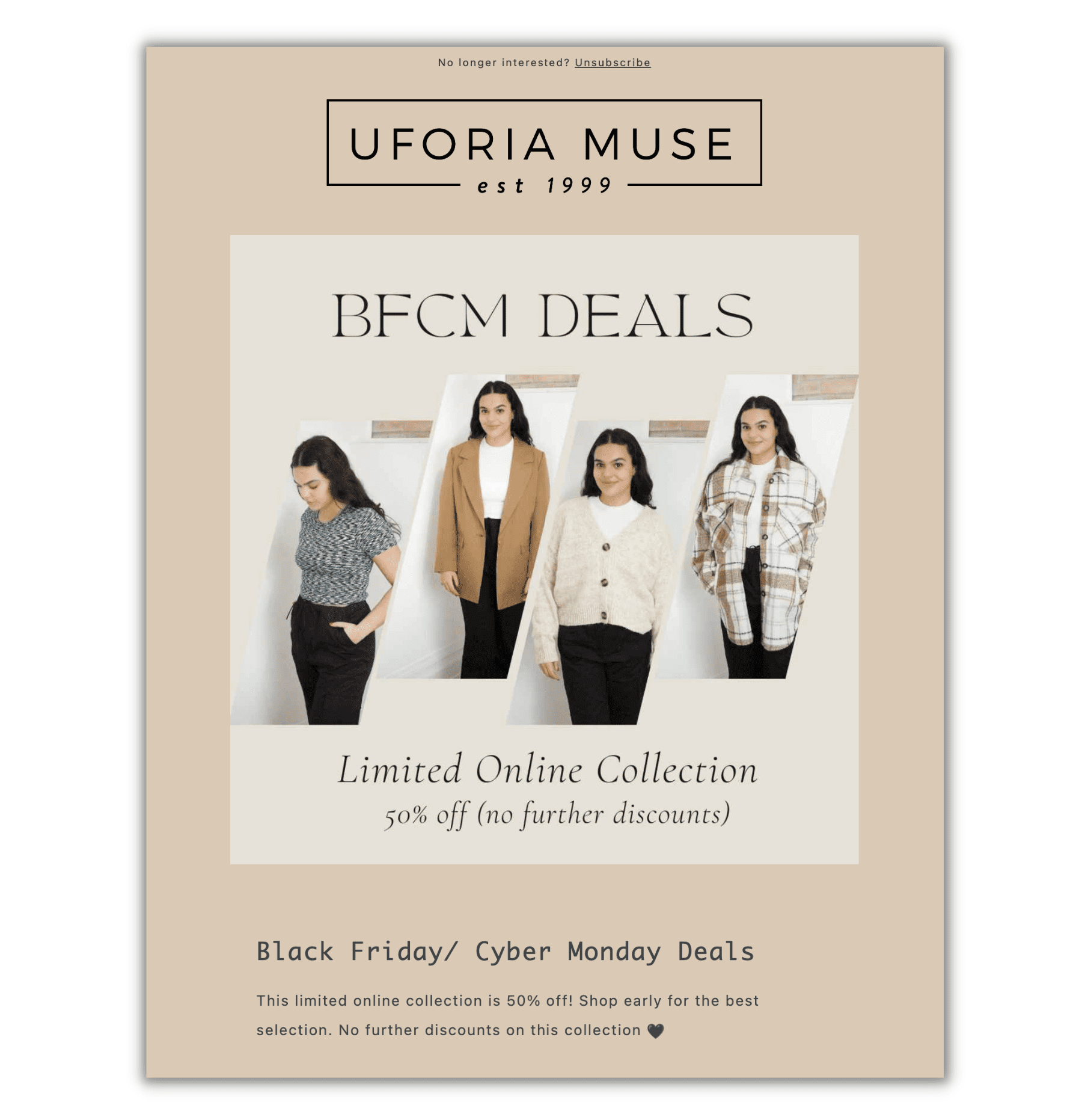
Have you played around with photo frames in Canva? They’re an easy way to give images a new dimension without much effort.
Uforia Muse, for example, uses the “header frame” shape in its Black Friday email to highlight a handful of limited-collection products.
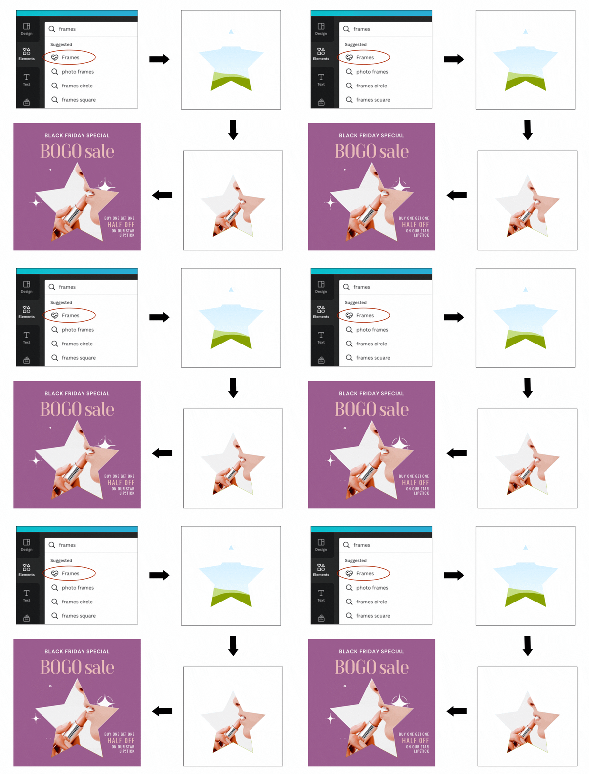
Here’s how to replicate it:
- Choose the product(s) you want to highlight and the corresponding images. We’re spotlighting just one product in our example below to show how impactful it can be.
- Type “frames” into the Elements search bar and select the heart icon that appears. Pick your frame and drag it onto the canvas. We're going with the star shape.
- Drag your chosen image into the frame. Resize the photo as needed. You’ll only be able to zoom into an area and enlarge it.
- Complete your hero image by adding text, color, etc. We brought in some sparkle — a GIF from Canva — and layered it under the star-shaped image for a touch of pizzaz.
#6 Product collage
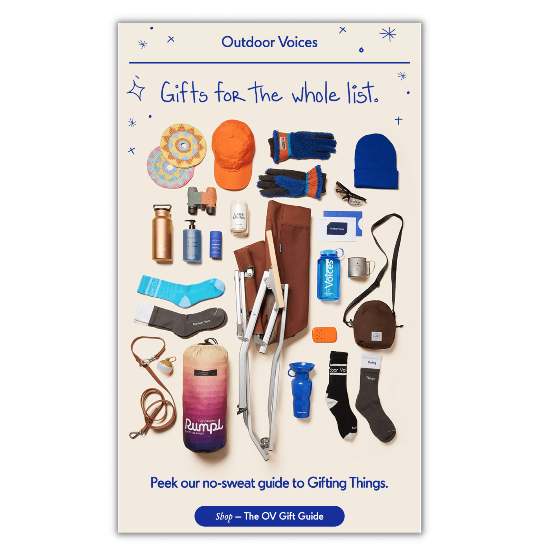
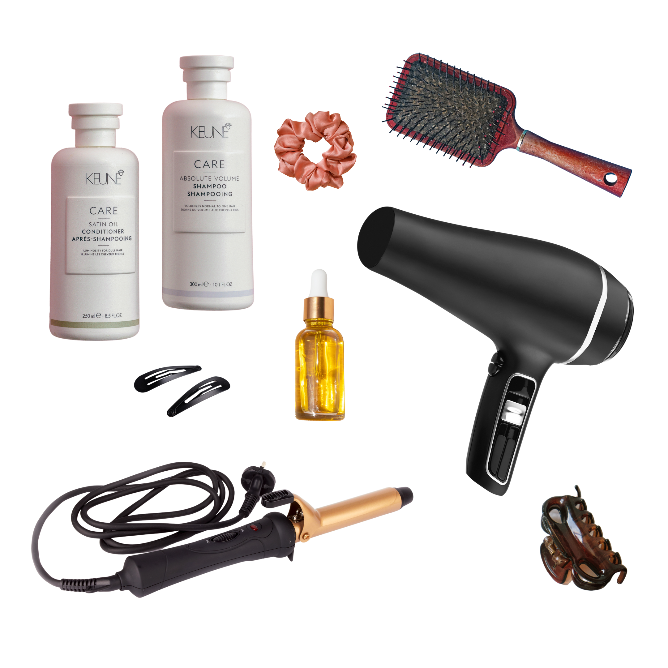
If the gift guide idea is part of your Black Friday email campaign lineup, steal this idea from Outdoor Voices. Featuring an array of products is a fantastic way to show the breadth of your shop.
Here’s how to replicate it:
- Gather images of all the products you want to showcase. They need to be high quality for this to work.
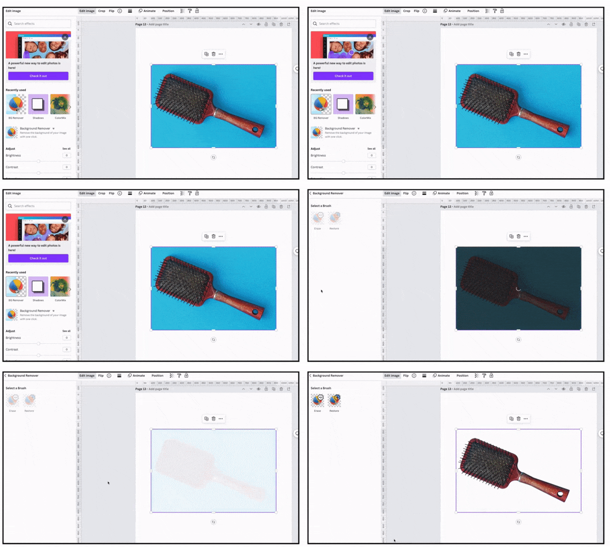
- Drag one image onto your Canva design and edit it with the Background Remover (see the video below). Repeat for the remaining.
- Size images so that the products are proportional. Reposition as you like. Add a background color if it suits the remaining Black Friday email design.
#7 Movement
Any type of movement built into your Black Friday emails is sure to intrigue. Easily do it with a Canva element, as demonstrated in example No. 5 above.
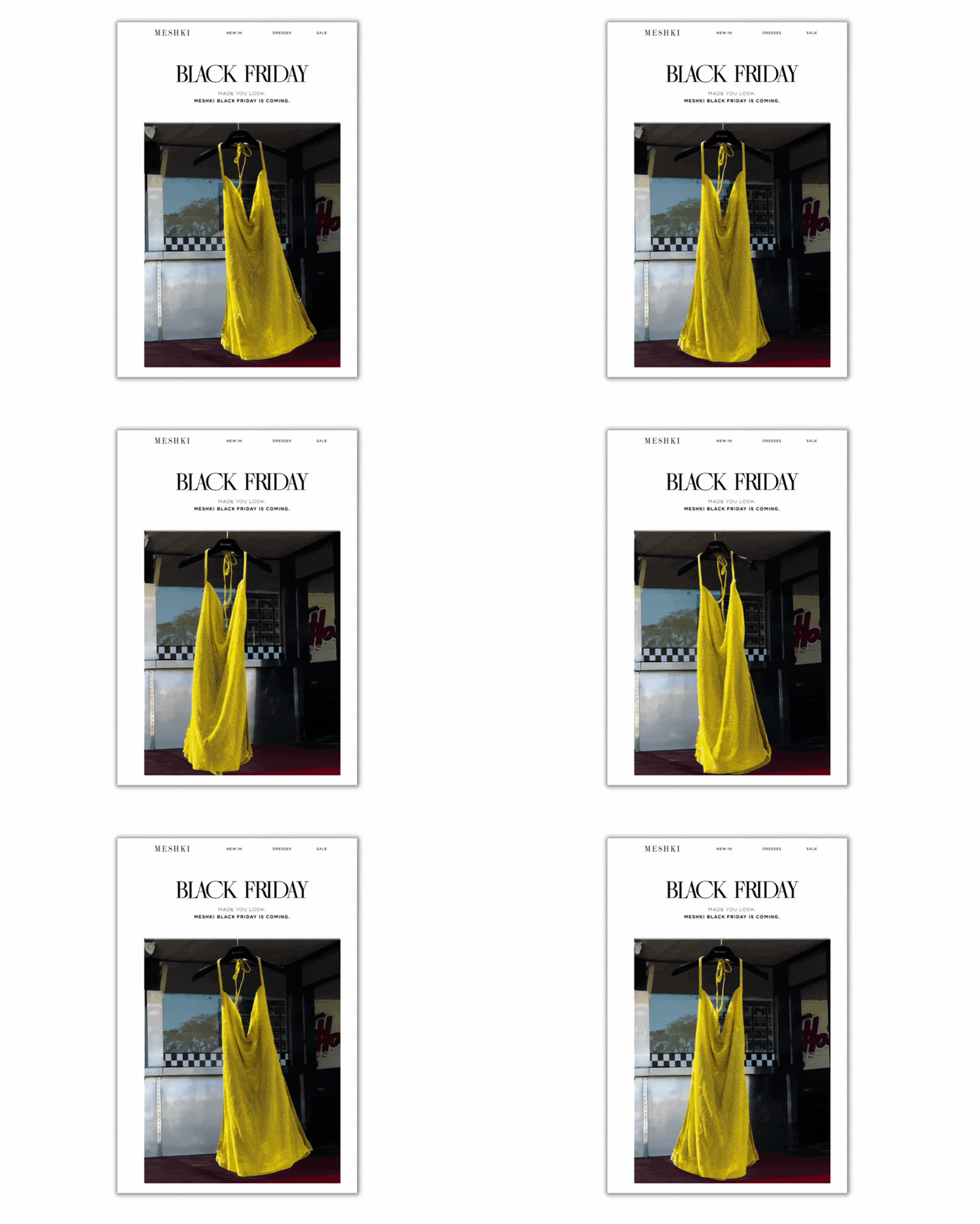
But you can also create an animation by clipping a video and turning it into a gif. Check out Meshki’s version. While the movement is simple, it draws you in.
Here’s how to replicate it:
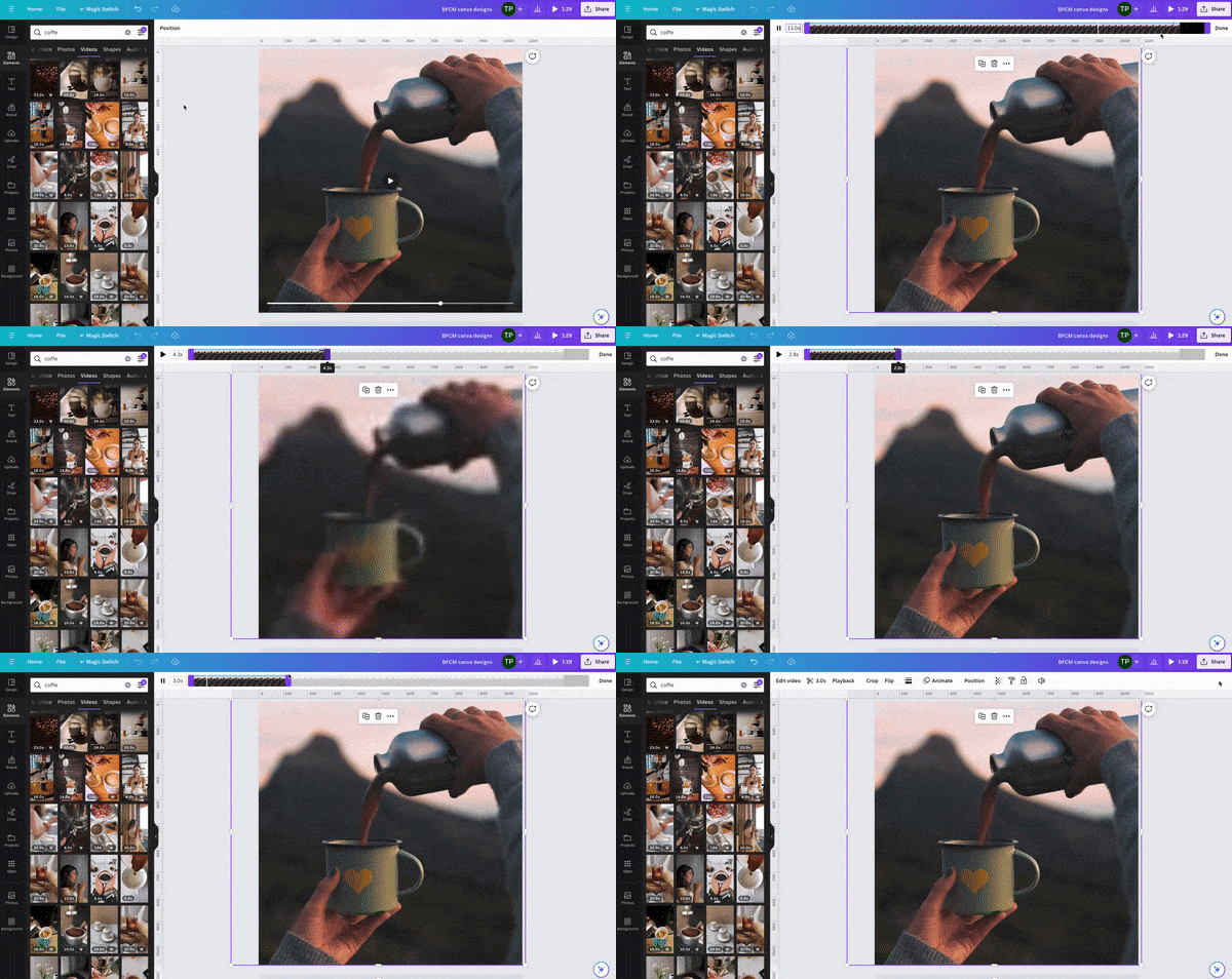
- Start with a video featuring a brand product. Alternatively, use a video from Canva if a generic one will suffice.
- Trim it down to a few seconds in Canva and download it as an MP4.
- Upload into ezgif.com using the ‘Video to GIF’ function.
- Compress if needed. Aim for a video GIF file size between 2 MB to 4 MB (simpler graphic GIFs should be 1 MB or less). Too heavy of a weight and load time will lag. Worst case, it won’t load at all. Not only do you waste your effort, but it makes for a lousy experience for the subscriber.
A word of caution around animation: don’t overdo it. One animation is good enough. The human eye naturally looks for a spot to rest. If you have too much movement throughout, how can the reader focus?
Supercharge BFCM email design with Canva + Seguno
Most Shopify merchants don’t have hours to create high-converting email designs for Black Friday and Cyber Monday. Their plates are filled with other business matters.
We built Canva inside Seguno’s email editor to speed up the creation of engaging images. You save time because:
- You’re not navigating between platforms with uploads, downloads, and sizing.
- Canva’s user-friendly interface doesn’t require a design pedigree. They call themselves the “visual suite for everyone” for a reason. You can also access millions of images, fonts, templates and other pro-level design elements.
- It’s easy to edit images, even after loading them into the email.
Use Canva and Seguno to remove the obstacles of creating brilliant Black Friday email designs, and do it in record time.
And if you aren’t confident in making a splash with your own devices, Seguno’s Black Friday email templates will do it for you.

create, manage, and track your email marketing—without leaving Shopify.
Seguno is the top-rated email solution built exclusively for Shopify. Grow your sales with high-performing newsletters, email automation campaigns, and integrations with Facebook, Instagram, banners, pop-ups and more. Build and send engaging emails in our easy-to-use editor and take email creation to the next level with our Canva integration. Automate your email marketing and drive more revenue with welcome campaigns, checkout abandonment, post-purchase automations, tag triggers and more.

get email marketing tips, resources, and industry insights to help your Shopify store grow.


